Life expectancy has increased, but...
Well, yes, but it's the slowdown that matters, I think

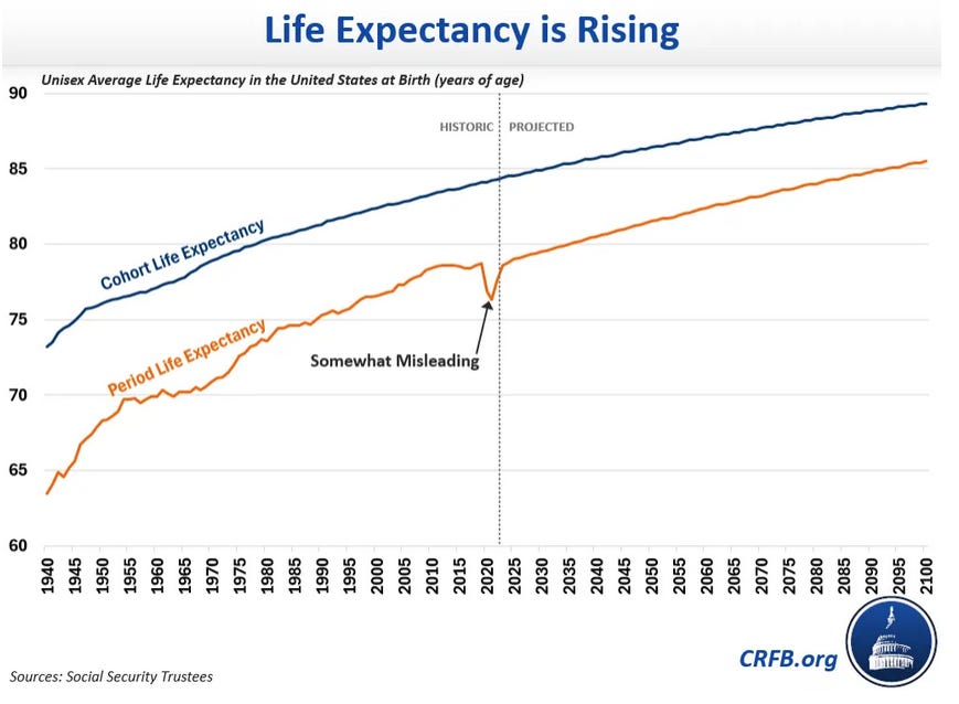
I was interested to see an argument by the Committee for a Responsible Federal Budget, that life expectancy in the United States has, contrary to popular accounts, increased.
In the long run, this is obviously true - it’s hard to argue that American life expectancy in 1940 was higher than it was in 2019.
“Although life expectancy growth has slowed some in recent years due to opioid use and other factors, claims that life expectancy is falling are – to quote CRFB board member Gene Steuerle – “downright misleading.” These claims are based on a measure that doesn’t show how long people will actually live and was measured during the height of the recent pandemic, when COVID-19 took over 1 million American lives.”
This argument differentiates two measurements of life expectancy (I’m quoting them below to write these definitions):
Cohort life expectancy: projects the average age of death for someone born or turning 65 in a given year
Period life expectancy: looks at the share of people who died at each age group in a given year and then uses those outcomes to measure the age the average person would die based on today’s death rates
The authors claim the superiority of cohort life expectancy over period life expectancy:
For this reason, period life expectancy did fall in 2020 and 2021. But that was a temporary phenomenon due to the COVID-19 pandemic. It has rebounded almost completely, and is clearly growing.
In contrast, the much more accurate and useful cohort life expectancy has continued to increase over time, growing roughly 10 months over the past decade and projected to grow 4 to 5 years by the end of the century.
How different are these measures?
Perhaps mortality scholars can correct me, but when I eyeballed the graph above, I would not have come to the conclusion that one of the two measures is superior to the other. Aside from the Covid scuttle, and the fact that cohort life expectancy is higher than period life expectancy, they looked pretty similar to me!
I grabbed the IRS period and cohort life expectancy data to take a look at the two.
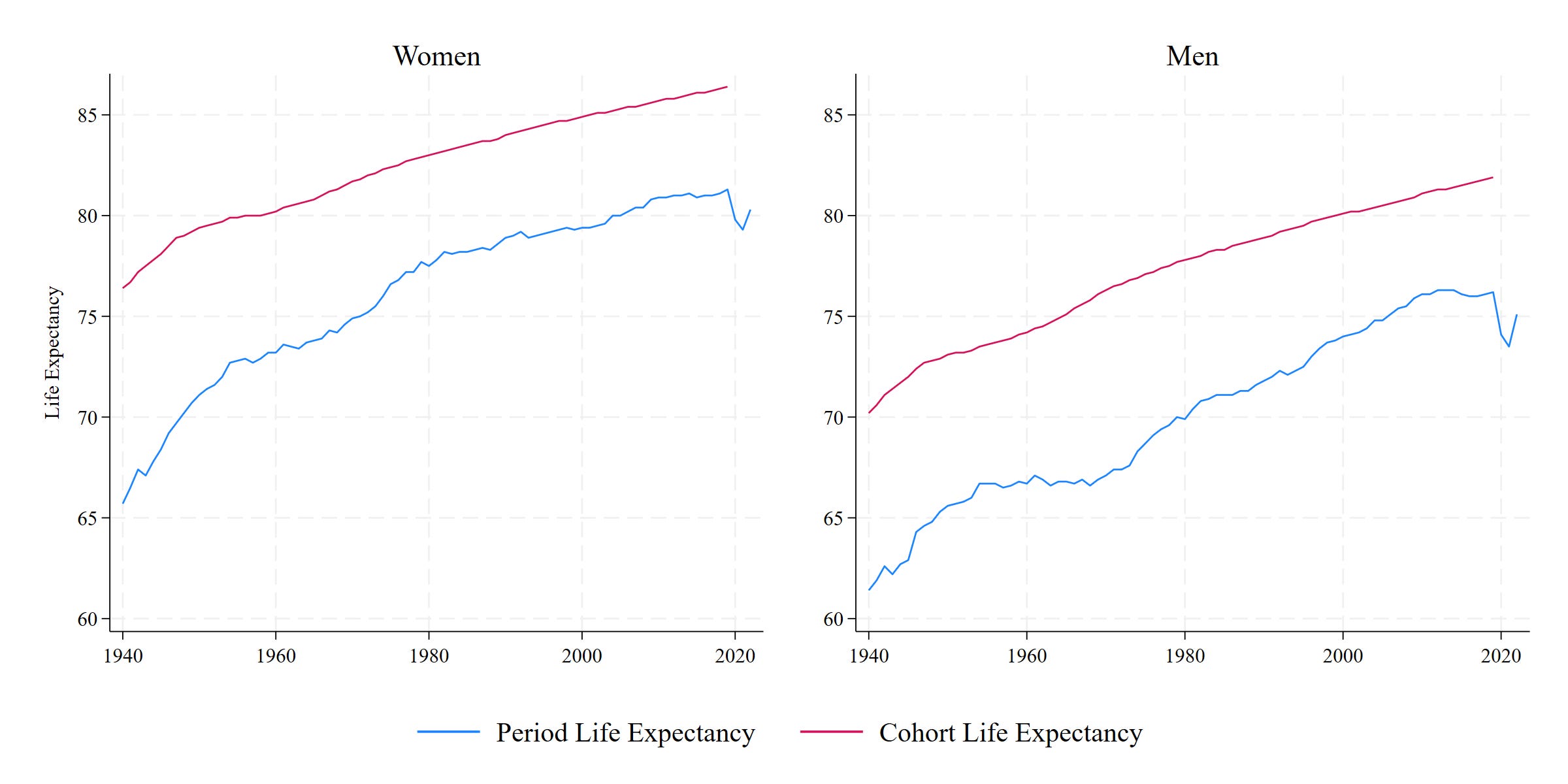
Cool! I can get the same trends (here we’re looking at men and women separately rather than combining the two). Looks similar. I don’t project beyond the present date because the future is weird and uncertain.
I first look at the simple correlation of the two measures. Correlations are statistics that show how related two variables are - a value of 0 indicates two completely unrelated measures, while a value of 1 (or -1) indicates functionally identical items.
The correlation between period and cohort life expectancy is 0.98 for men and 0.99 for women - very highly correlated!
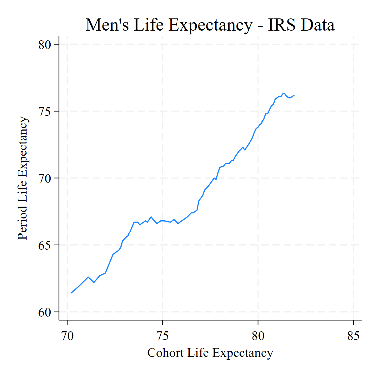
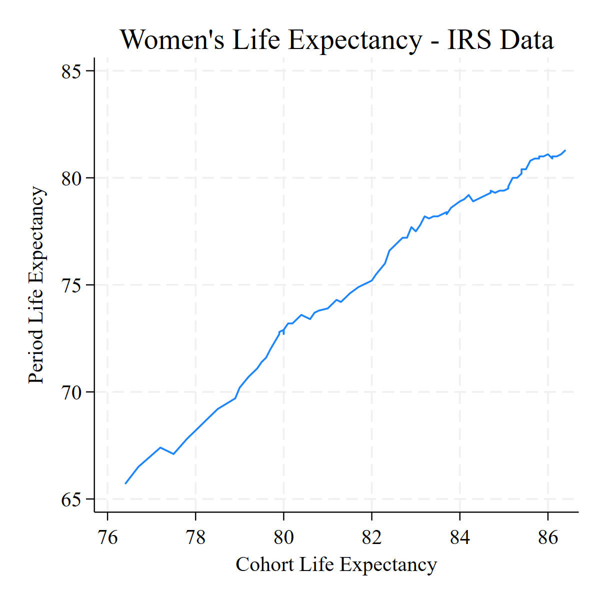
Here we’re not plotting the two measures separately against time, but one against the other. I see … basically a straight line with a little bit of inconsequential wiggle. I don’t get the sense that these would lead to radically different conclusions. Just that period is shifted down and is more responsive to Covid. I don’t get the claim made that one is obviously better than the other.
Levels versus Rates
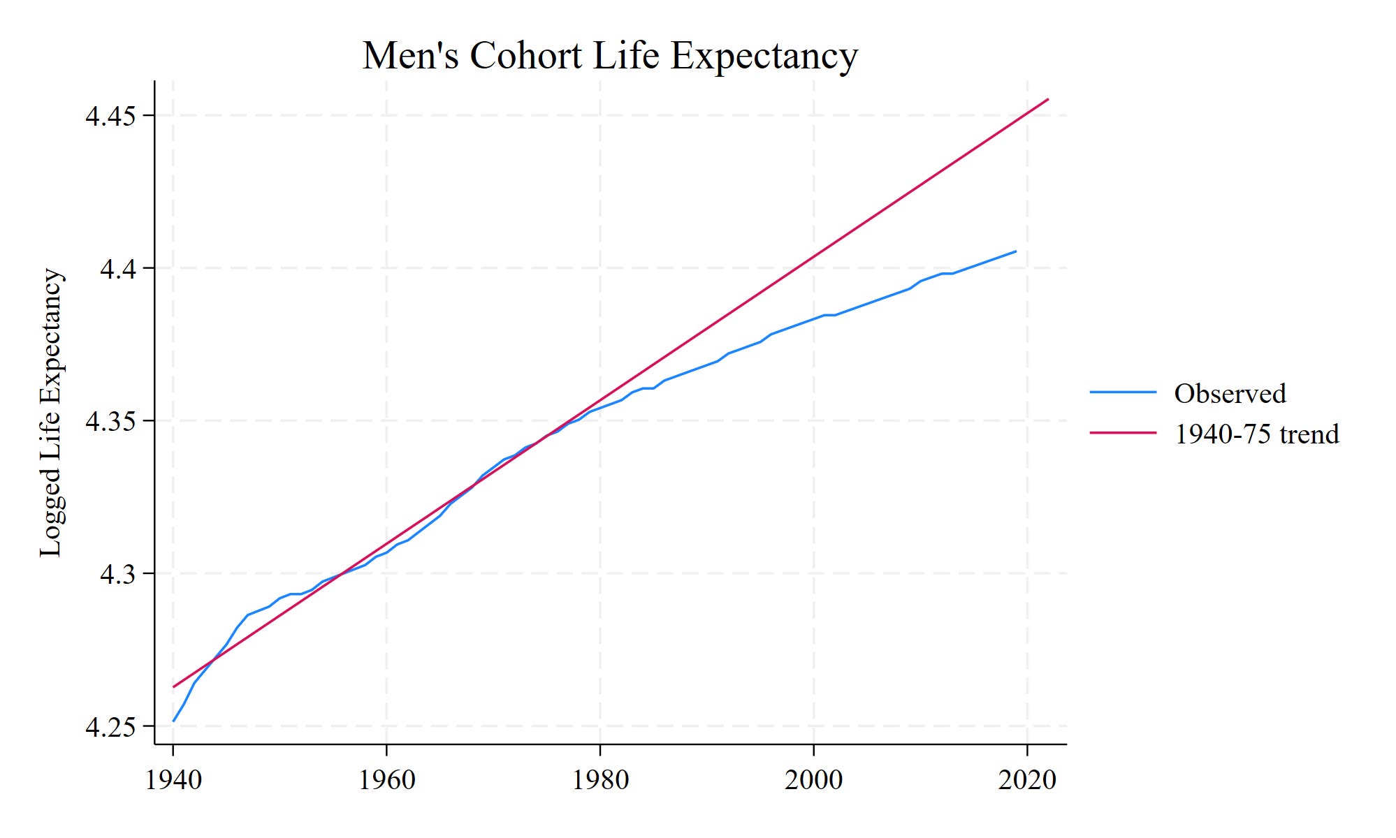
I tend to be rather simple in my thinking. Normally the simplicity of my mind means that I try to anchor my thinking to levels rather than trends. Trends can get you away from the big, blunt truths that guide everyday life (my joke is to continue moving up the derivative chain until you’re looking at group differences in the 5th derivatives, at which point you’re not really looking at society anymore). However, sometimes relative changes are what really matter. And this is one of those cases, I think, where relative changes are what really matter. Let’s look first at men’s cohort life expectancy:
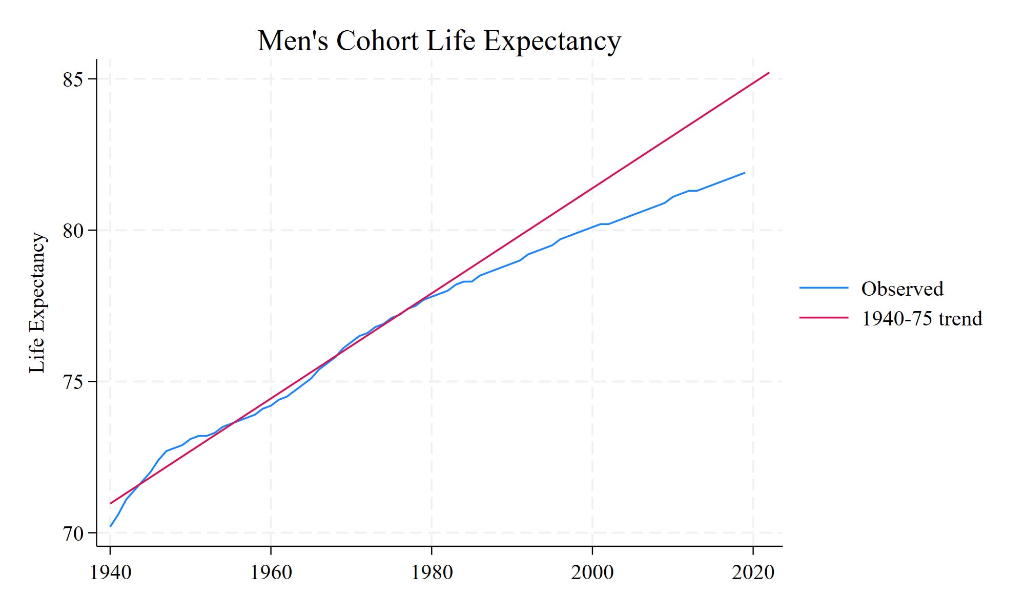
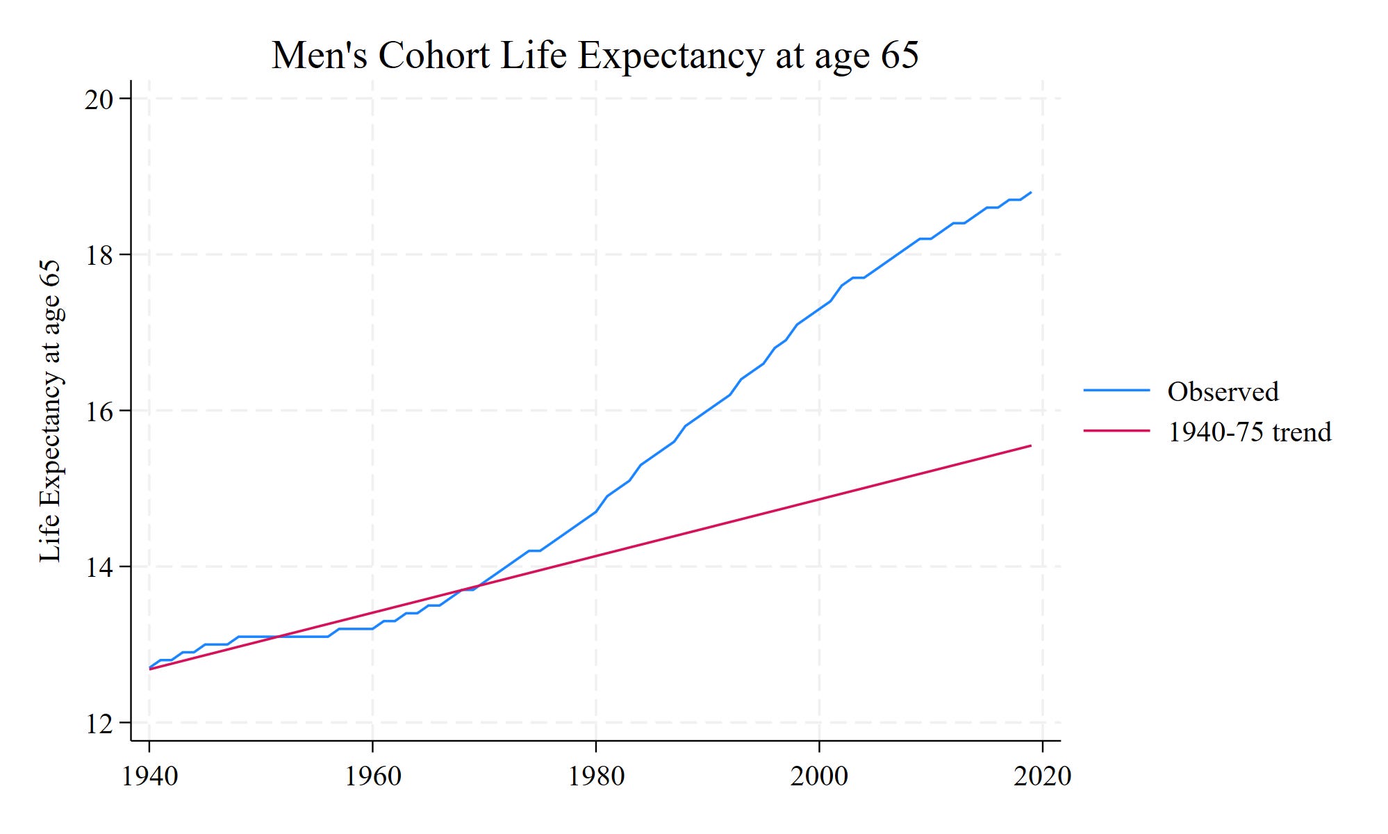
Below we see the observed trend in life expectancy for men (blue line), and the simple linear fit of life expectancy for men born between 1940 and 1975 (red line), extrapolated forward. For cohorts born in the 1980s onward, the increase in life expectancy has slowed down substantially. If the rate of increase that we saw between 1940 and 1975 had continued, we’d expect recent cohort life expectancy to be around 85. Instead, it’s around 82.
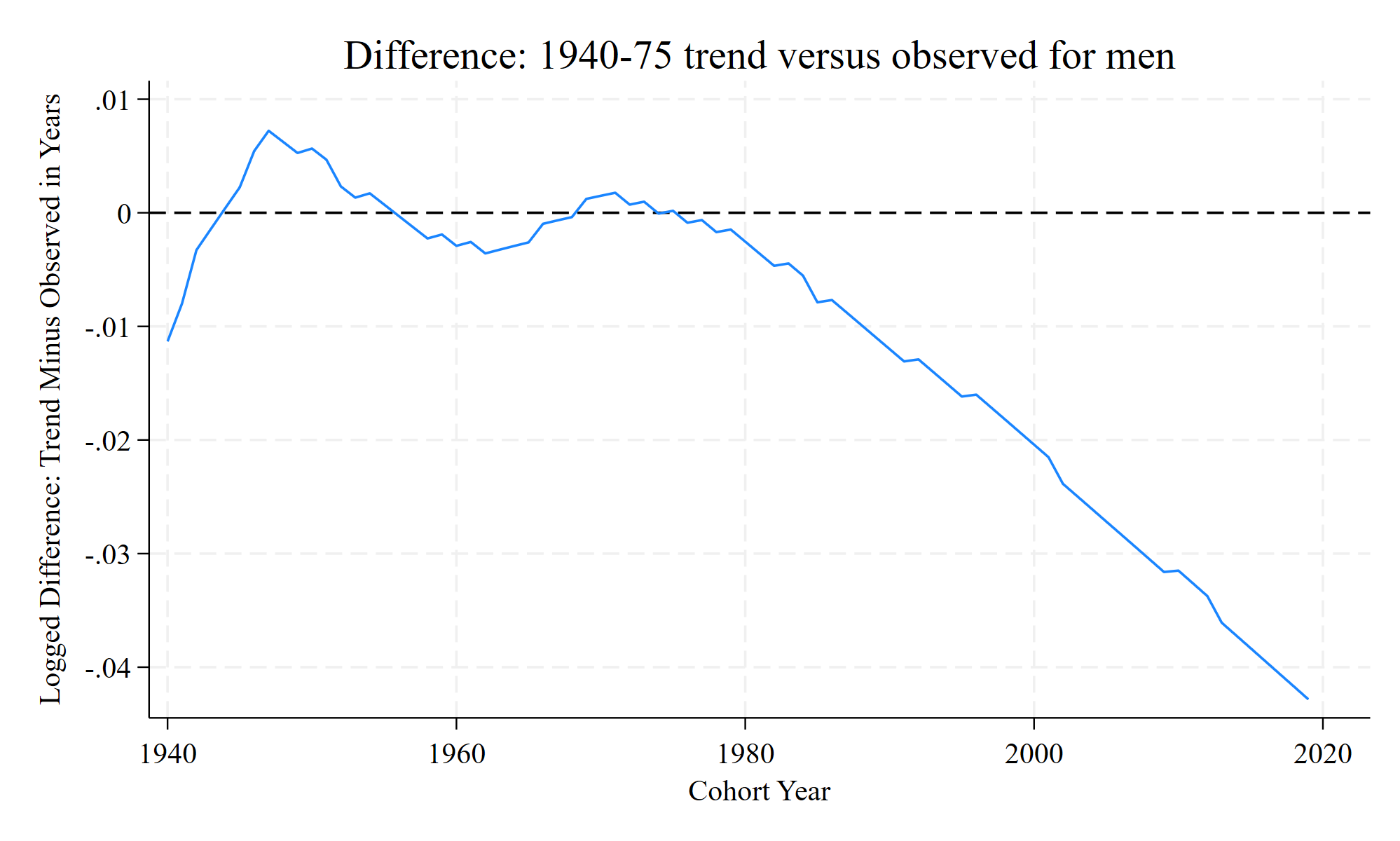
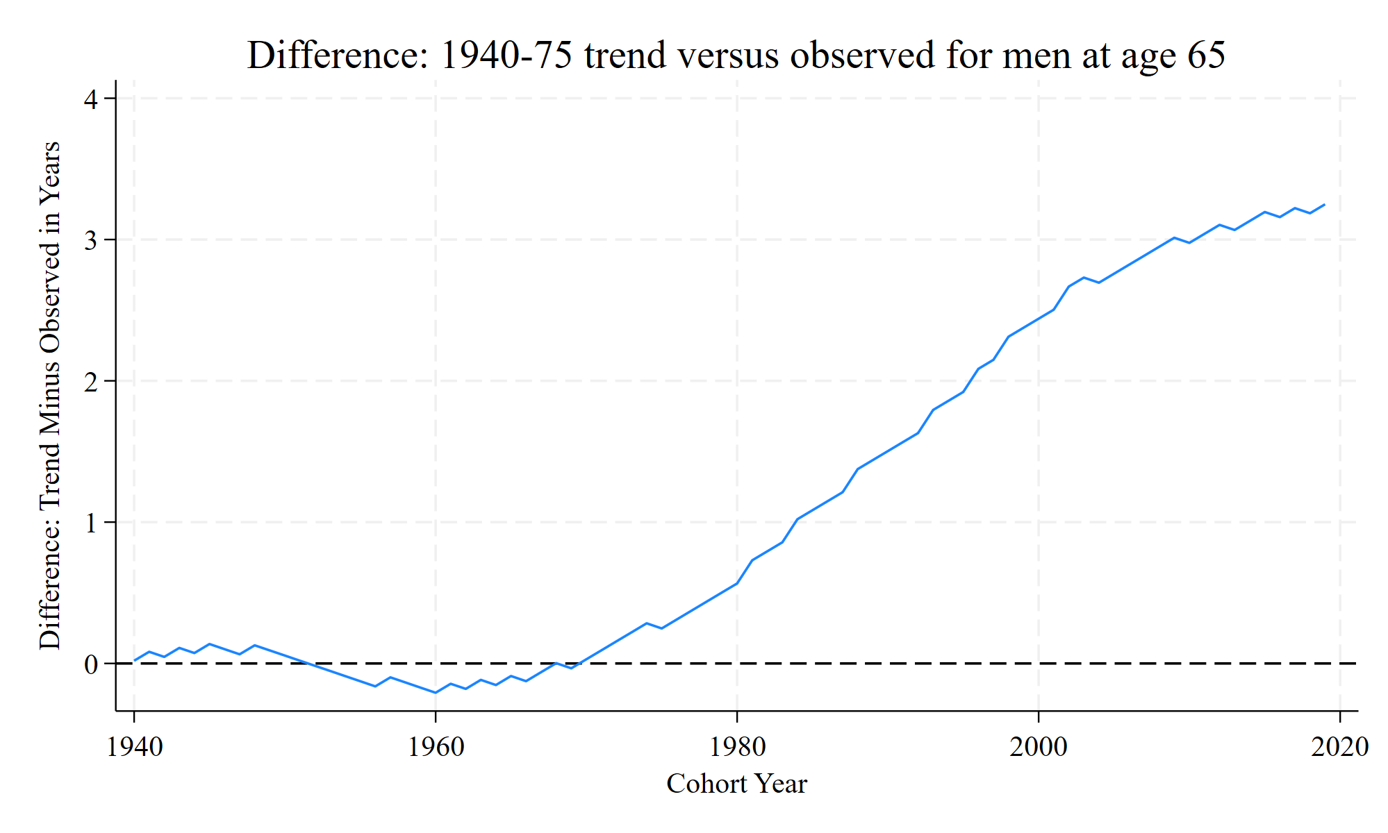
It’s a little easier to plot the difference, which is below:
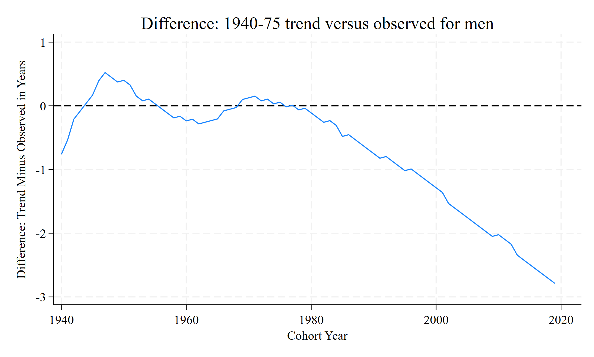
We see that from the 1980 cohort onward, there’s been a steadily increasing gap between the earlier trend and the cohort’s life expectancy.
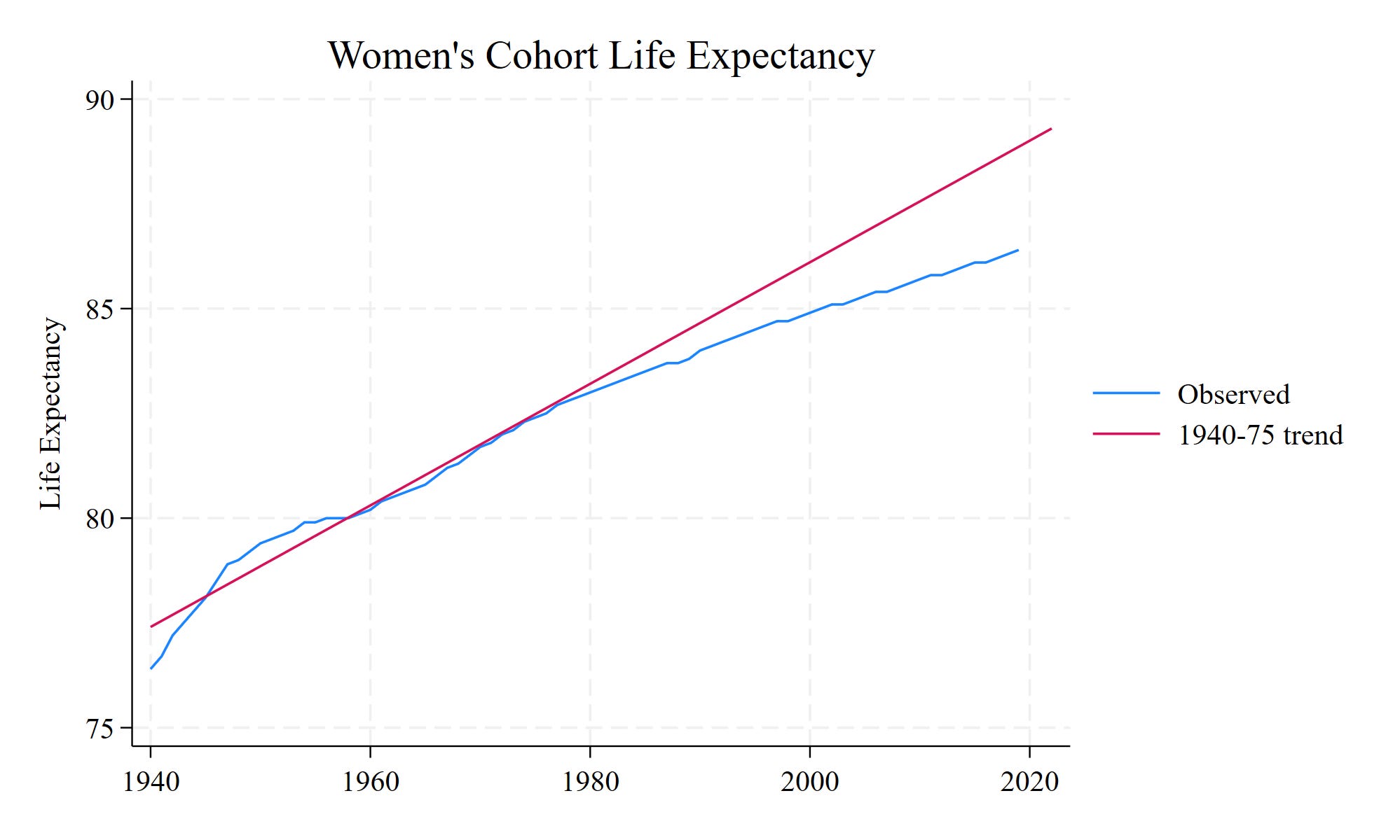
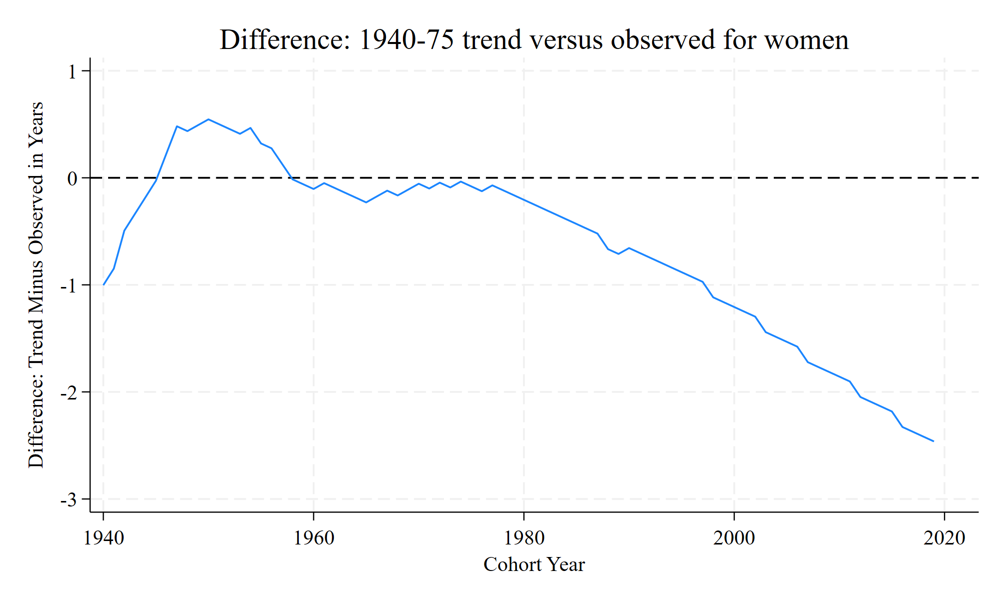
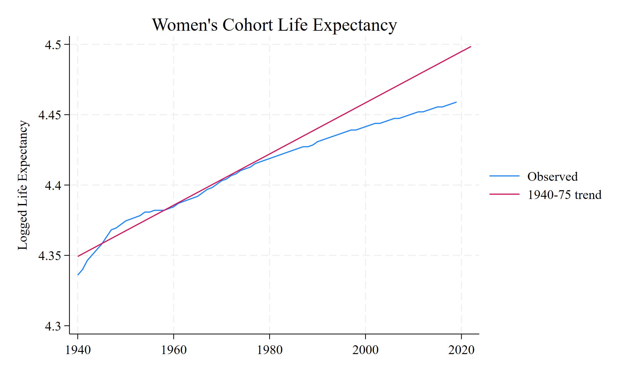
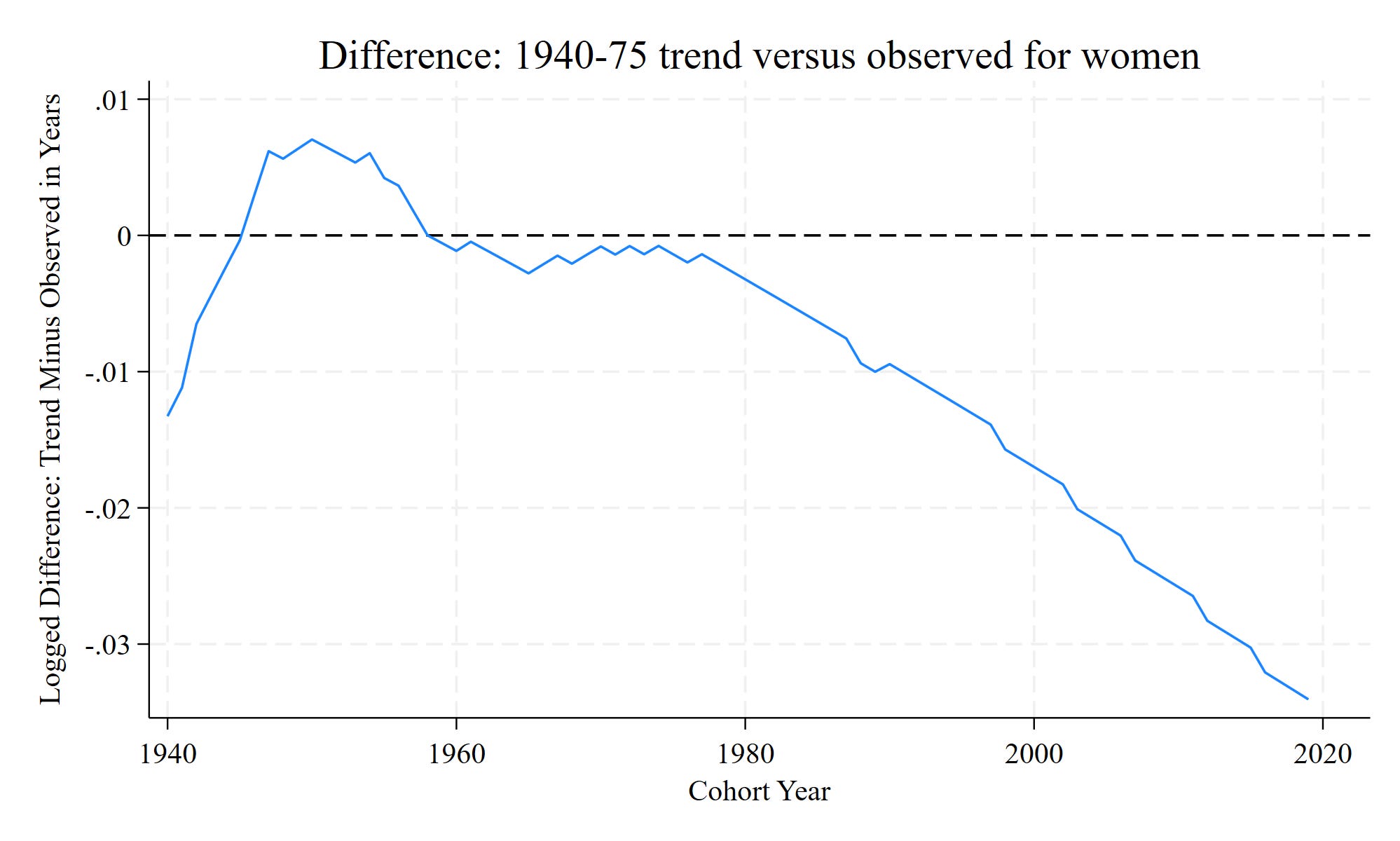
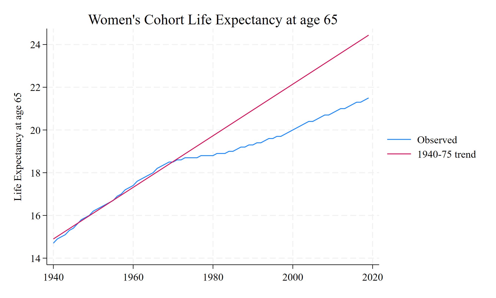
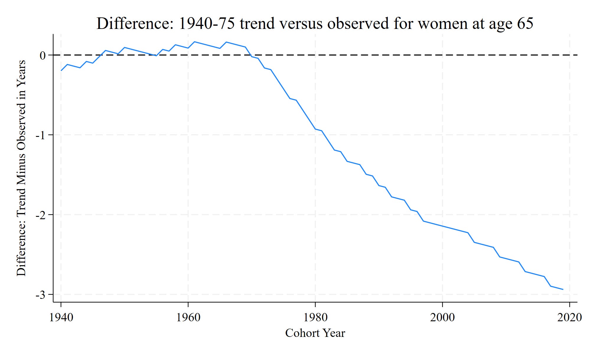
The same thing, though not as extreme, has occurred among women
Is this just a logged thing?
My first thought was: are we seeing a log-linear increase in life expectancy? Perhaps I’m looking at a linear trend when in fact it gets harder to stretch out life expectancy at the older ages Americans have achieved. Below I replicated the above using a log-transformed version of life expectancy.
Similar thing, and when you transform back to real values, you again get about 3 years less of life expectancy off the trend.
Similar thing for women:
You don’t see this discrepancy in 65 and older men’s life expectancy
You don’t see the diminishing trend in life expectancy among “life expectancy at age 65” trends. This measure indicates the expected number of years a person will live should they reach the age of 65. Below I replicate the same graphs that I made above:
Here we see the opposite occurring - among those men living to age 65, life expectancy has increased substantially:
…by about three years!
For women, it’s a different story:
Men who reach retirement age are outpacing earlier cohort trends. Women’s trends are lower by about three years. Men’s results show that we’re not required to decide that we’re in an era of diminishing life expectancy returns.
“Although life expectancy growth has slowed some in recent years…”
Just looking at cohort life expectancy, here’s what I have to say:
Is life expectancy higher among 2010s cohorts than 1940s cohorts? Obviously yes…
…however, my hunch is that pessimism stems from the comparison of a slowdown in life expectancy gains, rather than the absolute levels. “Things are not working as well now as they were in the past,” “there was a lot of promise and very little payoff,” “we paid for $1,000,000 of improvements and got about $10,000,” “I really thought I’d get an A in the class, but I got a C,” “I sent in the exact same application as my neighbor - they got the tax exemption and I didn’t.” These are statements of failures to live up to expectations, of relative comparisons between what happened and what you thought / hoped would happen. These kinds of perspectives really matter.
To be off of the upward trend of life expectancy by three years is a big deal! Three additional years of life is a very valuable thing.
We don’t need to see a slowdown. Life expectancy at 65 for men outpaced expectations. I suspect that this trend, combined with the cohort slowdown, represents a real doozy of an increase in life expectancy inequality among men.
Another perspective is to look at trends of American life expectancy against peer countries. I grabbed period data from the USA and Sweden. In the next life expectancy post I’ll see whether there are similar divergences from earlier trends in recent years.