

Wednesdata - How Many Women are Stay at Home Mothers?
I'm totally wrong about every answer to this question.

Note: On Wednesdata days, I try to answer a very small question through a handful of data visualizations.
I live a fairly segregated life. The vast majority of my work connections have advanced degrees. I live in a deep blue city that has a high level of educational attainment. I suspect that this leads me to hold a distorted view of basic social trends.
For example: what percentage of women are stay at home moms (SAHM)?
If I looked just inside mothers in my broader social network, I would probably reach something like 5%. If I doubled that to try and account for my segregated life, I'd get to 10%.
I assume that the rate of stay at home motherhood has declined significantly and continuously over time.
I assume that there are regional differences that roughly proxy religious affiliation - I'd guess there are higher rates in the South and Midwest compared to the West and the Northeast.
I assume rates of stay at home motherhood are lower among women with a college degree or more.
I assume that rates of stay at home motherhood are higher among self-identified Republican women compared to Democrats.
I assume that there will be big selection effects as a larger portion of women delay childbirth, or forgo it altogether. These will distort trends if we shift from looking just at mothers to all women aged 20-45.
Data Setup
I am using the General Social Survey to examine these trends. This dataset has been running since 1972. Its work status variable includes the option "keeping house," which I assume is a decent proxy for staying at home with children.
I restrict the sample to women between the ages of 20 and 45 with a non-zero number of children. I then compute the yearly percentage of women keeping house to get a sense of stay at home rates.
Finding 1: Aggregate trends

Well, my generous 10% guess based on my segregated life was way off. Between 1972 and 1990 the rate of SAHM declined from 60% to 20%. But from 1990 to the present, we see a rate that stays between 20% and 25%. My guess was half the actual rate.
Finding 2: There aren't regional trends

I am shocked - there aren't terribly meaningful regional trends. Just pure noise surrounding the aggregate trend. I am once again wrong.
Finding 3: There are modest education trends

So women with a college degree or more have lower SAHM rates than less educated women. But the large gap primarily occurred in the 1980s - during that decade, college educated women had about 20 percentage points lower SAHM rates. However, over the past two decades the education gap fluctuates between 0 and 10 percentage points, and we don't see continued declines among more educated women. Only kind of correct!
Finding 4: There are modest partisan trends
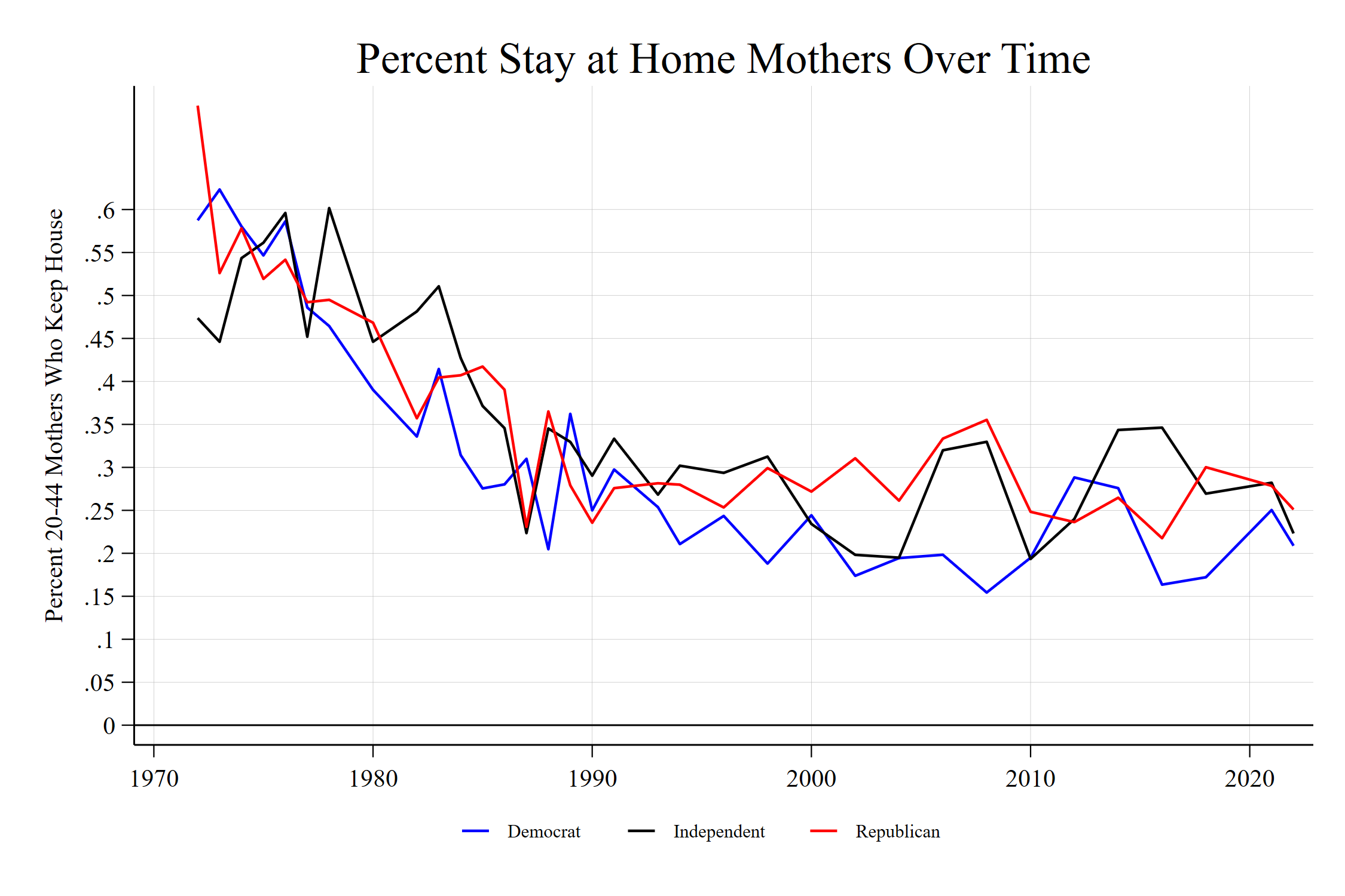
Well, this geriatric Millennial is living in the past. There _was_ an emergent partisan gap between 1995 and 2010, with Republican women about 10-15 percentage points higher SAHM than Democratic women. But look at the post-Great Recession - barely any partisan effects.
Finding 5: Selection Pushes Trend Down, Doesn’t Change its Shape

The graph above looks at three trends - the percent of SAHM among mothers, the percent of SAHM among all women age 20-45, and the percent of women age 20-45 who are not mothers.
I assumed that selection between mother and non-mother would have affected the trend line of SAHM. Nope! It simply shifts the trendline down by about 5 - 10 percentage points. So from about 1990 onward, between 15-20% of women aged 20-45 are SAHM, instead of 25-30% of all mothers. You also see the post-2010 rise of non-mothers in this age group after about 30 years of stability.
So my expectation is wrong again!
Conclusions
SAHM is way more common than I appreciated - between 1/4 and 1/5 20-45 mothers today are in the SAHM category, or about 15-20% of all women aged 25-45. All my assumptions about what predicts SAHM were at best small potatoes, and they were frequently rooted in the past.