Wednesdata - Wealth Changes
Good news in the short term, bad in the long term

Earlier in the summer, I saw an interesting tweet about wealth growth surrounding the pandemic:
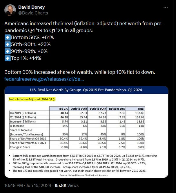
The message - Americans, especially lower wealth Americans, saw a big increase in wealth between 2019 and 2024. A very optimistic message!
I thought I’d go to the data source at the Federal Reserve and take a look at the data.
I’ll start by looking at the percent change in inflation-adjusted wealth across these groups that are provided by the Fed - (1) the bottom 50%, (2) the next 40% (e.g. 51-90th percentiles), (3) the 90-99th percentiles (4) 99-99.9th percentiles, and (5) the top 0.01th percentile (the top percentile of the top percentile).
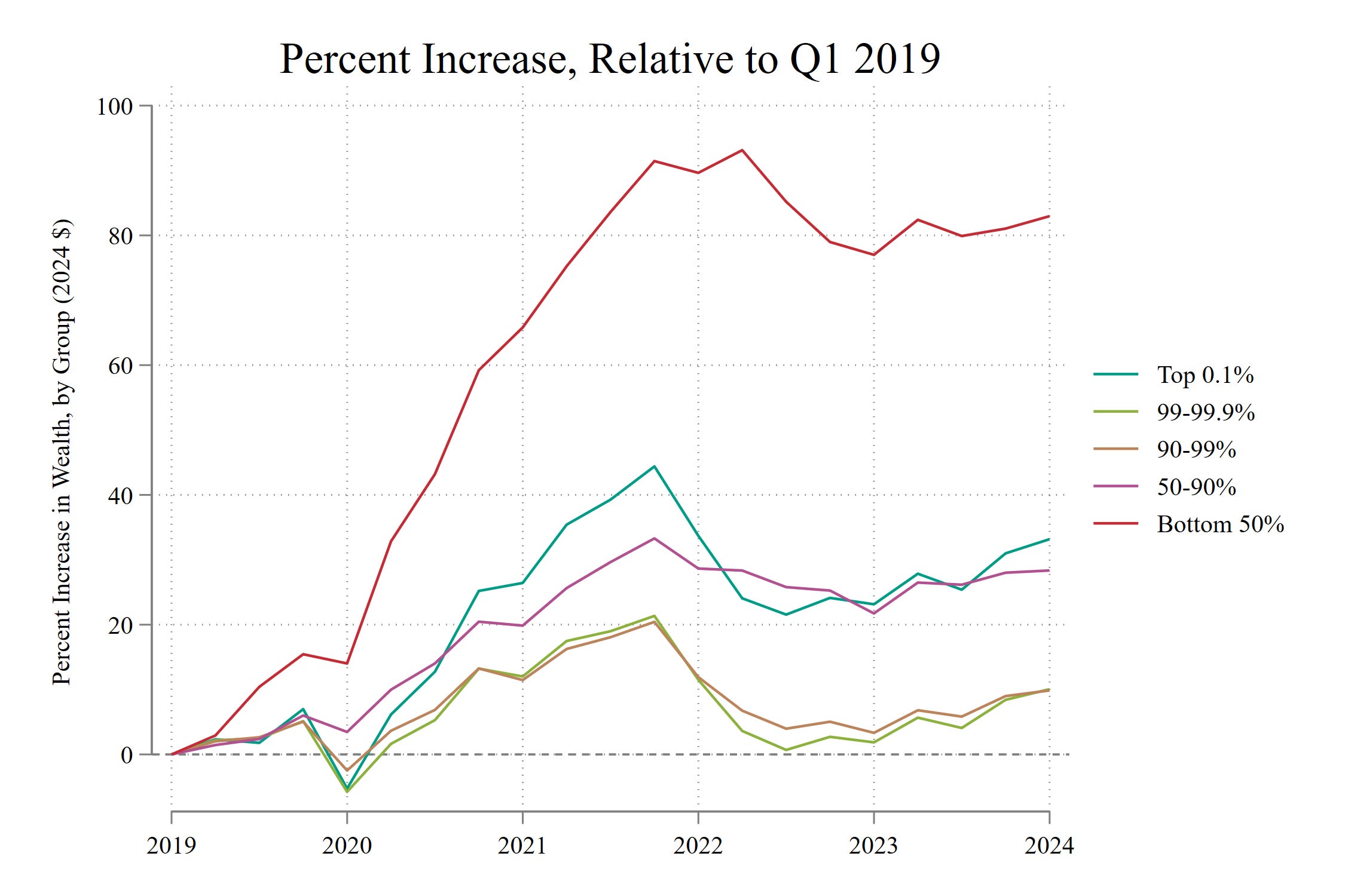
We see here that the bottom 50% had a distinctly large percent increase in wealth, increasing by about 90% through 2022, then declining a bit to an 80% increase by 2024.
Next up, the top 0.1% and the 50-90th percentiles each increased their wealth by about 30%. The top 10 percent, sans its top, had the smallest percent increase in wealth, about 10%. So far, good news for compressing the wealth distribution.
However, these changes take 2019 as a starting point. Let’s take a look at the full span of time available, which begins in late 1989. I will now switch to shares - e.g. the percent of all wealth held by the bottom 50%, the percent of all wealth held by the top 0.1%, etc. I think that wealth shares makes a bit more intuitive sense for comparisons over a long period of time.
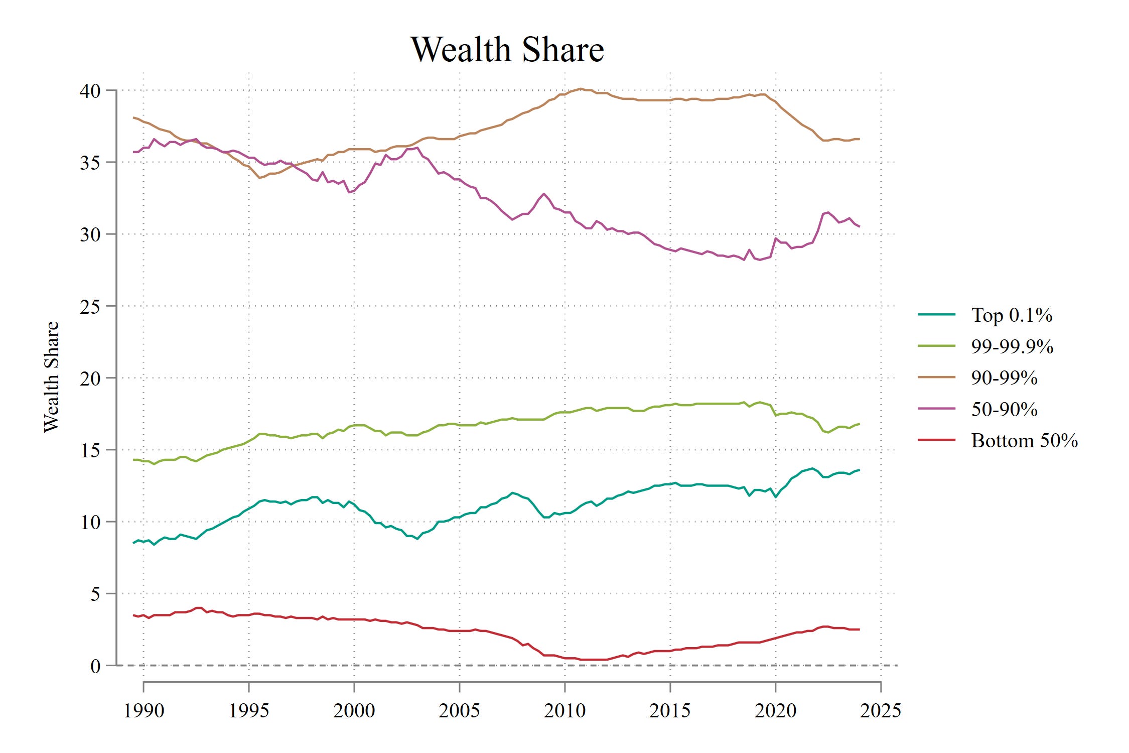
The bottom 50% has fluctuated by holding 4% and about 1% of the total amount of wealth. We see a nadir after the Great Recession for this group, and that 2012 to 2024 was a period where it rebounded to the previous share held in the mid 2000s. I’m old enough to remember 2005 and I don’t think that folks described it as the halcyon days of low-end wealth. Kind of rough to rebound up to that level.
The 50-90th percentiles have lost out on their total wealth share, declining from 35% in the early 2000s to 30% in 2024.
The top 0.1% has increased from about 8% to about 14% fairly steadily over this time.
Let’s look at the changes in percent of wealth held relative to 1989. The levels are so different in the graph above that it is hard for me to see the relative changes.
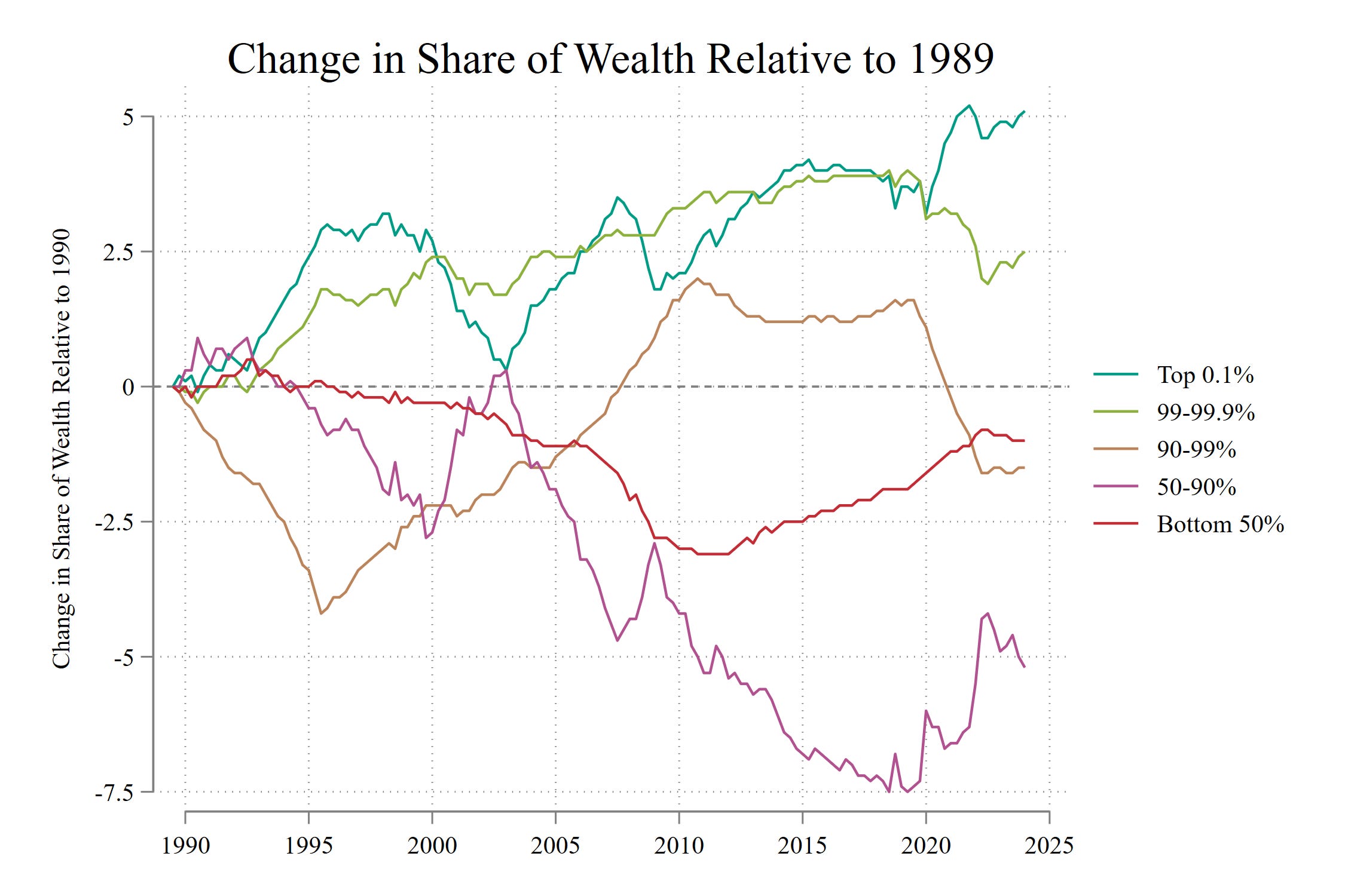
A few things stick out
The bottom 50% was hit hard during the Great Recession. But even during the disproportionate upswing surrounding the pandemic, this group is still worse off than it was just before the Great Recession. Still not a great time for the bottom 50%, historically speaking.
The 50-90th percentiles have really lost out, with a massive decline beginning in the early 2000s. Even the pandemic simply brings this group to the level it held during the immediate fallout of the Great Recession.
The 90-99th percentile just fluctuates all over the places - the 1990s were terrible for this group. The post-Great Recession period was good. The pandemic was bad.
The 99-99.9% only fares poorly when you look immediately in the pandemic period. The decline brings it to its 2005 share - hardly the dark days for the very affluent.
The VERY top, the 0.1%, simply keeps pushing upwards.
Conclusion
We only get optimistic news if we make our comparisons directly surrounding the pandemic. The bottom 90% is holding less wealth than it did at 2005. The bottom 99% is holding less wealth than it did in 2005. The top is doing very, very well.
If you think that extreme wealth inequality is a bad thing, then I think you could summarize the recent trends as: the pandemic mostly rearranged the deck chairs on the Titanic while Jeff Bezos watched from the moon.