Inequality Readers - The Great Inequality Discordance Era
Kids are moving home, while ETIC and SNAP are losing steam.

Nate Wilmers and Zach Parolin are perhaps the two leading figures in inequality research from sociology (notice that both are outside of sociology departments … what is that about?). Lukas Lehner is a very promising Assistant Professor of Social Policy who focuses mainly on European inequality dynamics (but you should check out his collaboration with Zach on the influence of WalMarts on poverty … shockingly cool. I plan to write about that soon. Good lord, Zach. Slow down!).
These three collaborated on a very interesting article that focused on a strange phenomenon. In the last few decades, earnings inequality (e.g. inequality of wages, salaries, and business incomes among individuals) have had one trends (stagnation and decline) where as household inequality (e.g. adding up all the earnings among people in a single household, as well as income transfers, income from private sources, and tax liabilities) has continued to rise.

The decoupling of these dimensions of inequality is weird and new.

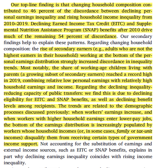
Let’s look at these trends. Focus on the left-panel of the graph below:

We have three measures of overall inequality - individual earnings (gray line), household earnings (just individual earnings added up within a household, blue line) and household income (household earnings, after accounting for taxes and transfers , black line).
Notice the change after 2010: individual earnings inequality started declining, a massive shifts from the preceding 40 years. But … household earnings continues its upward rise, while household income rises … a little.
A very weird time we’re living in! No wonder everyone is so confused and grumpy. How can you expect people to live with meaning and purpose when inequality trends are so inconsistent!?
This decoupling matters at a level of fundamental understanding of our society. Is inequality going up, or has it stalled out? That becomes a much harder question to answer if different kinds of inequality are moving in different directions. Many studies in labor economics focuses on wages of individual earners to make sense of the American labor market. But which type of economic dimension do people most fundamentally rely on and use to determine whether they’re getting ahead or falling behind - the dollars per hour of a particular work unit of a specific individual worker, or the collection of economic resources available at the household level?
At first blush, what looks like a cutesy little statistical comparison of two kinds of inequality in fact is laser focused on the deep substantive meaning of fundamental economic trends.
Since things are going to get a little complex, let’s begin with a pithy summary.
So, about half of this divergence is due to household composition. Most importantly - more people are “doubling up,” think of lower-earning adult children living with their parents.
The other half of the discrepancy occurs through a decline of transfers like EITC and “food stamps” (that is, SNAP). Lower earners are earning more, moving more folks above the qualification threshold for things like SNAP and EITC. And, more lower earners are living in higher earning households (again, think of folks moving back home with higher earning parents), which disqualifies a larger share from transfer benefits.
The Study’s Methodological Guts
So how do they go about examining the link between these two kinds of inequality? They use a high quality dataset from the Bureau of Labor Economics, the Current Population Study. They focus on core workers, or folks aged 16-64, part time or more, with a very low minimal threshold of earnings.

They compare individual earnings, household earnings (like individual earnings, but simply aggregated to the household level) and household income (adding in taxes and transfers).

I’m not entirely sure where they’re getting the transfer and tax income measure from the CPS? I’m guessing the Luxembourg Income Study (LIS)? It’s a little unclear in the paper. I think the Columbia Poverty Center might also have post-tax and -transfer income data folks can use?
(Update: One of the authors graciously let me know that the data are, in fact, very readily findable and accessible at https://www.census.gov/data/datasets/time-series/demo/cps/cps-asec.html. This was my oversight!).
To recap, here are their income definitions (top table) and basic trends of discordance (differences in inequality across these types):

Anyways, how do they measure inequality? They use ratios of percentiles, which is a pretty common way for folks to measure different kinds of inequality.
Let’s say that there are 100 people in our society. We line them up from poorest to riches. The 10th poorest person earns $100. The person in the exact middle of the line (person 50) earns $1,000. And the 10th richest person (person 90 in line) earns $25,000.
We can define various kinds of measures of inequality: the 90/10, the 50/10, and the 90/50. The 90/10 is 25000 / 100 or 250. The 50/10 is 1000 / 100 or 10. And the 90/50 is 25000 / 1000 or 25.
These measures let you think about overall inequality (90/10), inequality between the top and the middle (90/50) and inequality between the middle and the bottom (50/10). The earnings at these locations can change over time, letting us understand how inequality in total changes, and which parts of the earnings distribution are responsible for the overall change.
Let’s return to the inequality trends they focus on in this study:

The left panel is the 90/10 gap - notice it’s mostly gone up over time. The right panel is the 50/10 gap, or the inequality between the poor and the middle. Rising household earnings over time, including after 2010, rising household income over time, with rise after 2010, and overall rise of personal earnings, with a decline after 2010.
(They don’t focus on 90/50, I would guess because that’s simple increased over time. The top has continued to separate from the middle even in the era of inequality stability and decline. Yikes.)
This paper makes three simple methodological moves. First, they define their inequality measures based on one of these ratios. Second, they look at the relative trend over time.

That second equation is pretty simple.
Let’s say that our description of the 90/10 above was for our society in 1970. Then, in 1990, the 10th poorest person earns $125 and the 10th richest person earns $50,000. Our 90/10 is now 50000/125 = 400. The base level is 250 / 250 = 1. The change between 1990 and 1970 is 400 / 250 = 1.6. Or … inequality has increased by roughly 60%.
They then make discordance measures to examine different trends between different inequality measures:
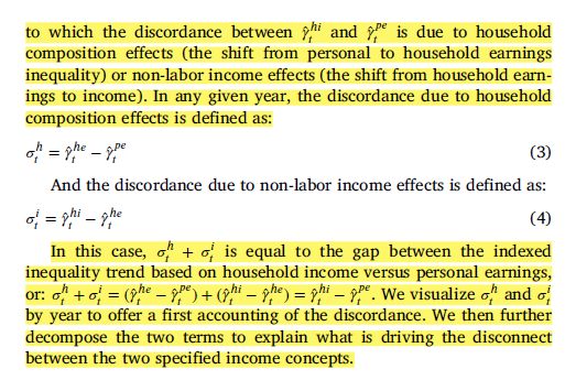
It looks complicated but it isn’t. Let’s say individual earnings inequality and household income inequality each grew by 60%. Their discordance measure would be 60% - 60% = 0. Let’s say that individual earnings inequality grew by 60% and household income inequality grew by 80%. The discordance measure would be 80% - 60% = 20.
These simple measures allow us to examine when, and how, these inequality measures move apart.
They then use an Oaxaca-Blinder decomposition technique to assess various contributions to trend discordances:

This looks very complex, and in some ways it is. But the basic logic. Recentered influence functions are statistical tools that let researchers look at distributional moments that aren’t just the mean. Here, that means the percentiles and their ratios. Decompositions: think of regression models that are fit among two groups, men and women. Men and women have different earnings that are entirely a function of whether people have a college degree. Decompositions let the researcher examine the extent to which the gap between men and women is due to compositional differences in educational attainment - e.g. 50% of men have college degrees, 25% of women do, and college degree holders earn more than non college folks - and the extent that the gap is due to returns to college - college men earn $1,000 more than noncollege men, college women earn $250 more than noncollege women.
They use these techniques to produce counterfactual trends of inequality that hold composition constant over time. The gap between observed and counterfactual can then be used to explain why and how discordance emerged.
The composition that they focus on: the nature of the household (number of earners, household types in terms of number of adults and children) and income sources (e.g. sources of transfer income, like SNAP).
Discordance trends over time
To begin, we see a reversal of discordance between household earnings and household income after 2010. Before, we see a steady decline. After 2010, a reversal and a rise. The discordance between individual and household earnings steadily rose over time.
So: focusing on the left graph: personal earnings and household income inequality were pretty consistently at the same levels. The value blipped to negative through the Great Recession and since then has been trending up, so we now have this decade long period of household income discordance resulting in stably higher household income relative to personal earnings.
Let’s look at the blue line: A steady march up. Household earnings inequality have become increasingly higher than personal earnings inequality over time.
Now, the red line: household income has become increasingly lower than household earnings. That is, since the 1970s, taxes and transfers have been doing more to reduce inequality at the household level. But, that trend reverses a bit over time, with the inequality reduction lessening.
The right graph focuses on 50/10 inequality … basically shows the same thing.
(notice - what if we extended these trends through 2022? Meh … nothing revolutionary has happened yet).
The authors’ description:

Why did we see these kinds of changes?
Discordance of Individual and Household Earnings - Household Compositions

Two major drivers: the share of secondary earners (e.g. fewer households with just one earner) and (from my reading of their table) changes in marriage rates.
They show this in the following table, which is a bit tricky to parse in an easy-breezy blog post.

Let’s focus on the column in the “P90/10” section titled “2010-2019”. It starts with the number 0.11. Think of that blue line above. Household earnings inequality grew by 0.11 points more in the 2010-2019 period than individual earnings inequality grew in the same period.
Of that 0.11 gap, about 0.08 is attributable to changing household composition (the other 0.03 is due to either returns to household compositions or not explained). Of that - the biggest hitter is “secondary earner” at 0.09. The next biggest hitter is “share of married” at 0.07.
The authors explain:

I’ve talked about this before, but adults living at home is really influencing long term inequality trends. An important footnote:

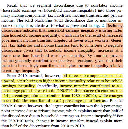
So, if we’re talking about why individual earnings and household earnings are becoming more different in the 2010 onward era, we really see a story of secondary earners. Think of a rise in adult children living in their parent homes.
The authors even show this rise in the appendix! More lower earning folks are living at home.
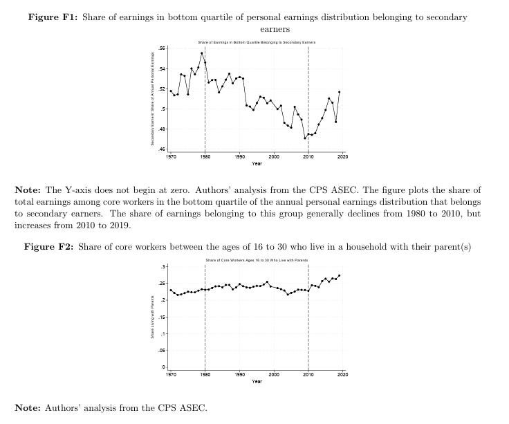
A wild fact that the authors don’t super highlight in this section, but is important for the overall pattern of findings: lots of these lower paid adult children living at home were in occupations that experienced pretty sizeable earnings growth! So … lower paid, but in lower paid occupations that were getting pretty sizeable earnings boosts! That will matter in a second.

Discordance of Household Earnings and Household Incomes - The Decline of Income Transfers and Tax Liabilities
What about the gap between household income and household earnings?
A big story of transfer incomes:

The authors’ explanation:
Transfers and incomes started doing less to keep overall inequality at bay after 2010. After 2010, the aggregation of earnings at the household level started to really push on rising household earnings inequality.
If we go a little further, which specific income transfers mattered?
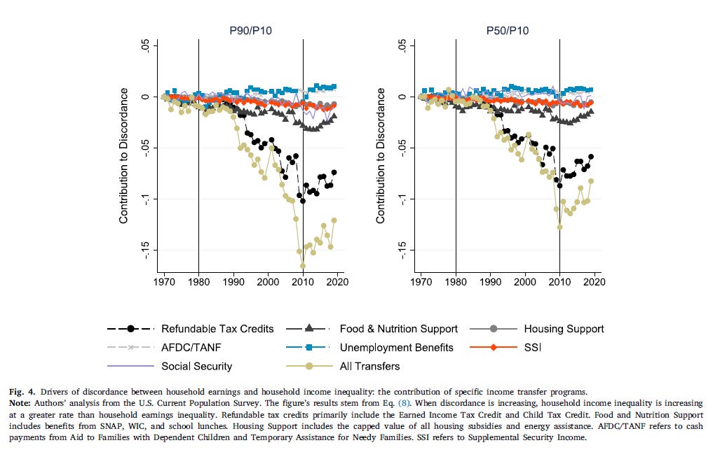
It seems that the really big hitters are refundable tax credits (like the EITC) and, to a much lesser extent, food and nutrition support. The authors’ interpretation:


So … earnings growth at the low end of the distribution and more doubling up in households reduced a variety of eligibilities for transfer incomes … creating a discordance between individual earnings inequality and household income inequality.

Another way to see this is how transfers occurred in different eras at the bottom, middle, and top of the earnings distribution.

Notice that between 1980 and 2010 (top right) EITC was a big player in rising transfers for folks who had low earnings. From 2010 onward, there was a decline of transfers going to folks with low earnings (bottom left).
AND, from 2010 onward, fewer folks with low earnings were participating in these kinds of transfer programs (left panel), even as the generosity of these transfer programs increased (right panel).

Summing it Up
The authors make an important basic point: inequality measures are more discordant today than at any time in the past half century. That’s important to understand! Why have we seen this weird trend beginning in the early 2010s?

Four things happened:
More lower earning, younger workers are living with parents.
Earnings grew quite a bit among those at the bottom end. But lots of this low end growth ended up among younger workers who live with parents.
SNAP and EITC have declined in their “inequality reduction” power.
This decline is due to (a) more people not qualifying due to higher low end earnings and (b) more lower earners living in higher earnings households, removing their qualification.
Some Stakes
One of the things that this paper brings to mind: the trend of adult children living with parents seems to just be really important for understanding the last decade and a half.
I wrote about how this trend has screwed up popular facing optimistic hot takes about a wealthy Gen Z:

It seems that this trend is also decoupling dimensions of inequality and reducing the effectiveness of the EITC, which … are kind of big deals!?
My hunch is that inequality research needs to go pretty hard on this trend. I’m really excited to read Hope Harvey’s new book on the topic, which will hopefully motivate more research on the topic.
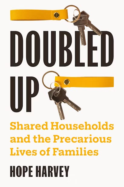
The book description:
More than fifteen percent of US children—over eleven million—live in doubled-up households, sharing space with extended family or friends. These households are even more common among low-income families, families of color, and single-parent families, functioning as a private safety net for many in a country with extremely limited public support for families. Yet despite their prevalence, we know little about how shared households form and how they shape family life. Doubled Up is an in-depth look at the experiences of families with children living in doubled-up households.
Drawing on extensive interviews with sixty parents living in doubled-up households, Hope Harvey examines what circumstances and motivations lead families to form doubled-up households, how living in shared households affects daily routines, and how families fare after these arrangements dissolve.
Harvey shows that although families rely on doubling up to get by in the face of rapidly rising housing costs, precarious labor markets, and unaffordable childcare, these private arrangements are rarely sufficient to overcome such structural barriers. And doubling up incurs its own costs for both host and guest families. For doubled-up families, negotiating household relationships and navigating shared space reshapes family life. Understanding the dynamics of doubled-up households extends scholarship on family life beyond the nuclear family and points the way toward better policies that will serve all families.
This paper also really complicates the answer to the question: has inequality increased? I mean, the answer right now is: yes and no … depends on what you’re talking about. That’s an answer that is academically very interesting but will likely sow a lot of confusion in public debates. The time for nuance, humility, and uncertainty is upon us, I suppose.
I think this is a really interesting paper. It seems like they put a strong focus on the secondary earner but didn't really discuss the composition of marriages (which is also a strong contributor). It would have been nice to see the changes in relative income within households for 2 married adults just for comparison. The SIPP data would be able to give a lot of insight here as well.
Either way, nice article! I very much respect what you're doing with your Substack. I just started out and have one post, but I am trying to do a similar thing, except I am using multiple econ/sociology papers to answer a question rather than going into detail on 1. I graduated from Penn with my PhD in Economics in May.
Looking forward to reading more from you!
Other than rising costs of housing, what explains the increase in multigenerational households?