Some of you might remember the brief controversy in the 2010s caused by Wisconsin Congressman Paul Ryan’s proposal to radically simplify the tax code - making it simple enough to fit on a postcard.
During his time at Vox, Matthew Yglesias wrote a slick summary and criticism of the proposed tax policy reform. I liked this argument by MY partly because it includes the point that while Ryan’s proposal was foolish, simplifying the tax code probably was not a terrible idea. This little episode was brought to mind as I saw a new paper kick up some controversy about the basic trends of income inequality since the 1960s, a paper that made me very sympathetic towards the Ryan-sian idea of radically simplifying the tax and transfer system in the US.
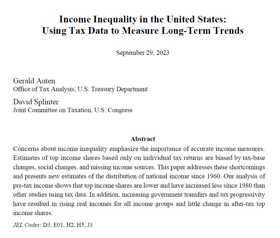
Get ready to hear the following argument a lot due to the new paper by Auten and Splinter : “Actually, inequality has not changed since the 1960s.”
I’m already seeing this article act as the basis of a lot of news and blog stories,
Auten and Splinter are careful economists who work for the government as tax analysts. They know a heck of a lot about the American tax and transfer system. I think they do good work overall and that their findings should be taken seriously by anyone who wishes to better understand inequality dynamics. Auten and Splinter (AS) are responding to the work by Piketty and Saez (PSZ), particularly at the trends constructed by PSZ regarding the income share held by the top 1%. AS are very skeptical about the trends produced by PSZ.
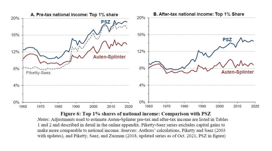
The figure below from AS’ new paper nicely shows their main conclusion.
Piketty and Saez (PSZ) found dramatically rising inequality both before and after tax and transfer. Pre-tax, PSZ find the top 1%’s share increased from 12% in 1960 to 20% in 2019, and the after-tax share increased from 10% to about 15%. AS find the pre-tax share increased from about 10% to about 14%, and the post-tax (e.g. income after tax and transfer redistribution) has barely budged away from its 1960s levels, changing from 8% to maybe 9%. That is - no real inequality growth in the past 60 years.
Big it true.
The AS paper has some major strengths. They nicely document many of the questionable decisions made by PSZ when constructing their top income measures (e.g. PSZ counting only gains, not losses, for certain business incomes, generous assumptions about missing kinds of income, etc.). I was convinced by many of these critiques. The AS paper needs to be taken seriously by folks who want to understand the true reality of inequality change.
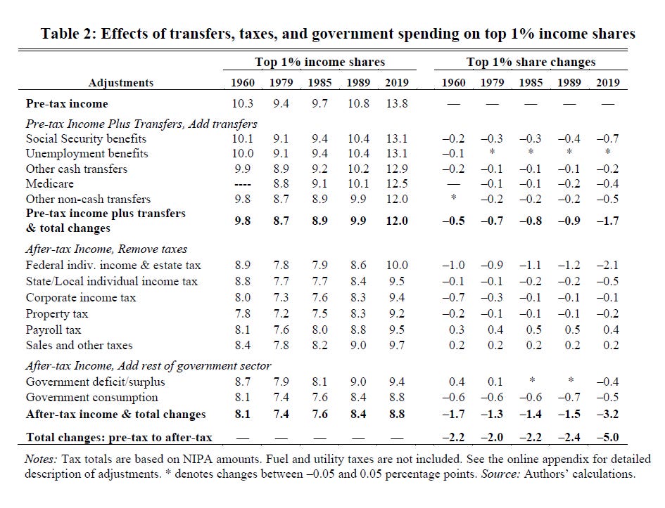
Nevertheless, I am quite skeptical of many of the decisions made by AS. Fortunately, AS are transparent about the decisions they made when constructing income before and after taxes and transfers, as well as the relative contribution to their overall findings made by each of these decisions. The table below is a beast to read, but shows the relative contribution to the top 1% income share for many of the main decisions AS made to pre-tax income measures and post-tax income measures (we’ll look at another table of big changes shortly).
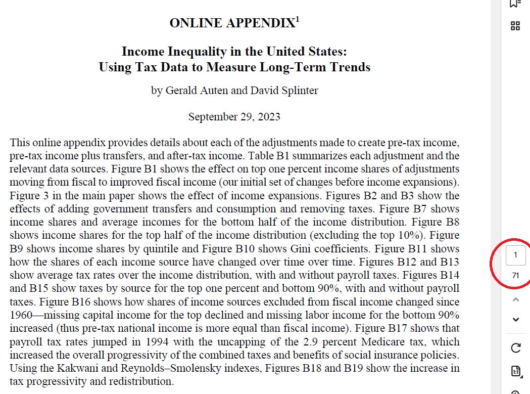
Some of these decisions are very reasonable (e.g. adjusting for federal and state/local taxes, incorporating social security). Others, I’m not so sure about. I read their appendix, which provides a lot of details (71 pages!) about their assumptions, decisions, and definitions when adjusting income shares. Below I’ll highlight some of the concerns I have about some of the more consequential decisions.
Income by Individuals, Not Tax Units
AS construct the top 1% not by tax units (e.g. a husband and wife count filing jointly count as a single unit) but by individuals (e.g. a husband, wife, and their three children count as five individuals).
Marriage rates have diverged between the top and the bottom of the SES distribution, and so AS argue that there are too many people lumped into the 1%.
This decision has a very large effect on the size of pre-tax income going to the top 1%
So a household with four people - two parents and two children, count as four individuals, not one household. This single decision accounts for about 1/2 of the reduction of pre-tax income going to the top 1% (-2.9 of the total -5.6 change in their estimates). How reasonable is it? To me, it seems weird to count Bronze Mahomes, a baby living with Brittany and Patrick Mahomes, as contributing as much as America’s 1% income share as Jeff Bezos, an adult. If we’re talking about household income, it seems perfectly logical to focus on households as the main unit of analysis.
AS also equivalize incomes by household sizes to rank their income units. That is, if four people living a house earning $120,000/year, they divide by that value by the square root of the number of people in the household: 120,000 / sqrt(4) = 120,000 / 2 = 60,000. This decision offsets a fair amount of the individual ranking. This is confusing to me - I don’t totally get how this ranking could increase the share of 1% income. Definitionally, it could only shift high-income multi-individual households down the income ranking and single persons up, right? These changes would shift larger households down the income ranking, smaller households up the income ranking. I suppose this trend could be explained by a single income being spread over multiple individuals in the 99% and a single income matched with a single person in the 1% - again, I find this a weird decision that doesn’t quite smell right.
Regardless, combined these two somewhat odd decisions of defining the unit of analysis account for about 30% of the total pulling down of top 1% income. That’s a massive chunk of results drawn from a questionable unit of analysis decision of treating Bronze Mahomes and Jess Bezos as equivalent units.
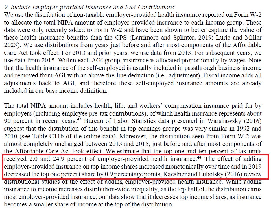
The American Health Insurance Mess
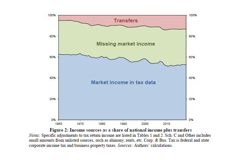
AS argue that a massive, and growing, share of market income (pre tax) is missing, or hidden:
A sizable chunk of this missing income is the tangled mess of insurance and healthcare policies, payments, and taxes.
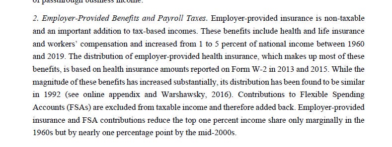
Adding employer-provided health insurance had a meaningful effect on total results.
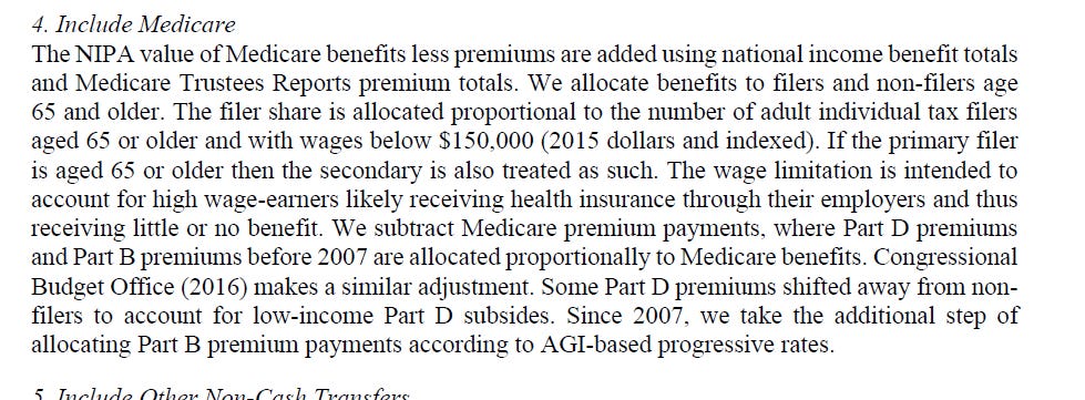
They also include Medicare as income
I’ll just say: the American insurance system used for the purchase of healthcare is a very strange system, one that I wouldn’t exactly point to as egalitarian-producing. My understanding is that both patients and healthcare providers struggle under a very strange system that seems to extract a bunch of resources from both. I also understand that prices and monies associated with various types of insurance are nebulous and targets of resource extraction. I’m skeptical that these should be seen as income in the sense of income differences between the rich and the poor, at least as occurring in our current welfare state system.
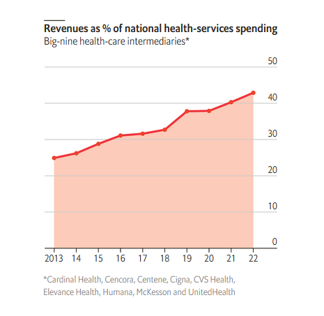
The Economist had a nice recent article about the weird situation of the contemporary health insurance system.
The issue with America’s healthcare system, which the Economist describes as in a malaise:
The country spends about $4.3trn a year on keeping citizens in good nick. That is equivalent to 17% of GDP, twice as much as the average in other rich economies. And yet American adults live shorter lives and American infants die more often than in similarly affluent places. Pharmaceutical firms and hospitals attract much of the public ire for the inflated costs. Much less attention is paid to a small number of middlemen who extract far bigger rents from the system’s complexity.
A massive chunk of this rising spending goes to oligopolies that sit in between healthcare providers and patients - insurers, chemists, drug distributors and pharmacy-benefit managers (PBMs).
Especially following the ACA, a bunch of policy and regulatory changes pushed these intermediaries to expand to a bunch of worrying parts of the healthcare system, going through a bunch of mergers and acquisitions that likely didn’t do much for price or quality for patients:
Yet vertical integration can have adverse side-effects. For example, many studies have found that after hospitals acquire physician practices, prices increase but quality of care does not. A health-care company that controls many aspects of patient care could raise prices for rivals wishing to access its network. Some also worry about physicians being nudged towards offering the cheapest treatment to patients, lowering the quality of care.
This is all to say - I’m very skeptical that these pools of money are in reality inequality-reducing.
Government deficits and surpluses
A weirdly large amount of change is due to this decision. To be honest, I’m confused why this decision is in here - it looks like AS are following PSZ and arguing that their measure of this decision improves upon the PSZ decisions. All look like accounting tricks to me. If AS are indeed following and improving upon PSZ’s contribution of deficits / surpluses to inequality measures, I blame PSZ for a weird decision.
Public infrastructural spending
Not the biggest deal for changing the overall trend of top 1% income share, but consistently pulls down the level. I’m largely in agreement with AS that this decision is full of uncertainty. I’m not convinced it belongs here.
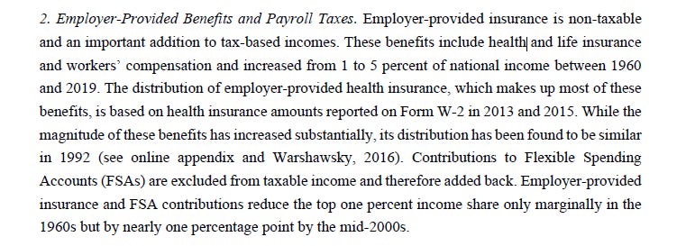
Employer-provided benefits and payroll taxes
Again, a big chunk of the changed trend over time, and I’m guessing that it’s largely because of the awful and at somewhat fake system of insurance. I’m skeptical that we should think of the current system as benefiting the typical worker and reducing inequality.
A whole slew of business and corporate earnings
I’m not the most qualified person to assess these decisions. But there are a ton of weird decisions and adjustments regarding profits and business income that are super consequential for the conclusions drawn by AS.
So the AS trends depend a lot on a large bundle of assumptions and decisions, some reasonable, some strange. Unfortunately, PSZ have the same bundle of issues. Where to go from here?
The CBO is probably decently correct
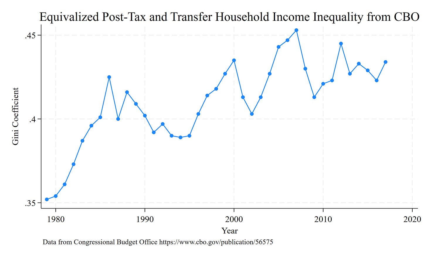
The CBO publishes inequality reports that include inequality estimates before and after taxes/transfers. The below is a graph of Household Income Inequality change since 1978, after taxes and transfers.
This suggests a ~ 23% increase in inequality over a similar timeline, less than the 70% increase argued by PSZ but more than the null-to-10% increase documented by AS. I think this is a reasonable compromise to anchor one’s expectations.
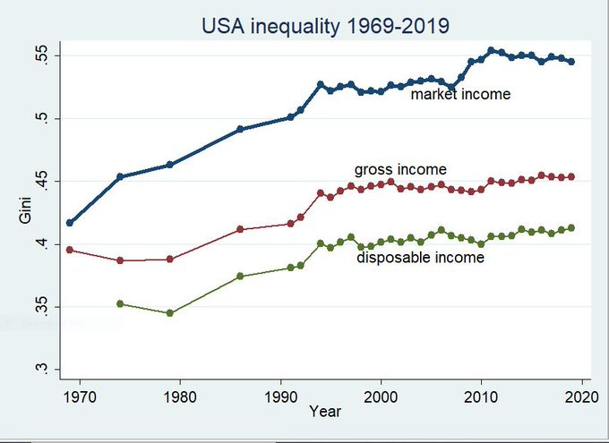
Branko Milanovic recently tweeted out inequality trends adjusted for taxes and transfers using Current Population Survey data modified by the high-quality cross-national LIS database. Similar conclusions to the CBO.
His data shows a ~ 18% increase in disposable income inequality1 since the mid 1970s. Again, in between AS and PSZ.
Another look: Billionaire inequality
Blair Fix has a fascinating examination of an alternative dimension of inequality - the Gini coefficient among individuals on the Forbes 400 list.
We see that wealth inequality has been massively increasing among the richest 400 Americans between the mid-1980s and today. The whole blog post is fascinating and really worth a read. Fix goes way beyond this in very interesting ways. Do yourself a favor and pop over there.
It’s useful to think about the credibility of the combination of these findings with AS - do we really think that inequality has stalled or declined everywhere in the income distribution, but that top wealth has experienced this massive inequality increase? What would that world look like? How much inequality decline would need to occur within the rest of the 1% to balance out this super-top stretching out?
I have a hard time envisioning a world where these trends can coexist with overall inequality staying the same. It’s much more likely to think that this spreading out has generally occurred among the top end of the socioeconomic distribution, typified by the very top.
Keeping honest - absolute mobility
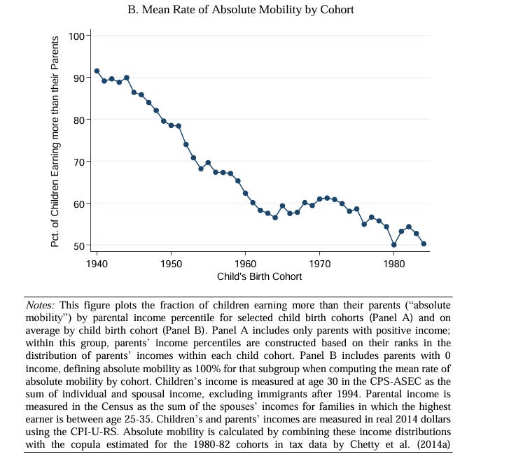
If I’m going to question the assumptions and conclusions of AS, it’s worth noting that other major inequality findings, findings that point in a direction that I’m more sympathetic towards, probably have massive error bars too. Take the Chetty et al. finding of declining absolute mobility across birth cohorts. Here is their bottom line finding - that the percent of birth cohorts earning more than their parents has declined substantially over time:
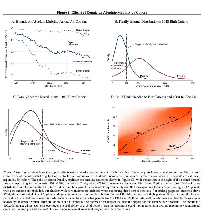
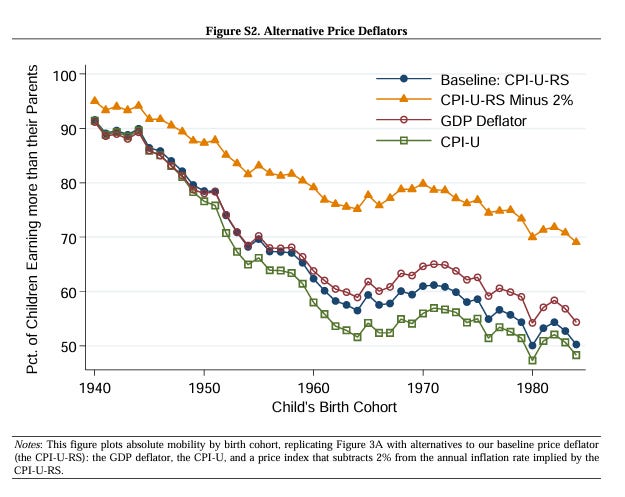
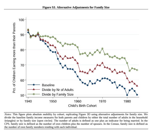
The above figure is what I typically focus on and talk about when I talk about this finding. However, Chetty et al. were very transparent in documenting the different results they could produce with different assumptions:
Very wide ranges of possible conclusions, even when remaining within this single team’s set of analyses. Unfortunately, few scholars have access to these administrative data (the US has an awful system of data access in the name of privacy). So not too many skeptical research teams will be able to interrogate the nature of this range of uncertainty. If I’m going to be a bit hard on AS’ findings, I think I also need to be much more skeptical of the main findings of a bunch of inequality studies I’m much more sympathetic towards. We probably don’t have great, sturdy knowledge about some of the fundamental and basic stratification trends and processes.
My curmudgeon take: market inequality matters
I’m going to write about this more in the future, but a lot of the debate between PSZ and AS focus on post-tax and -transfer income inequality. This measurement of income is sensible, since it’s the set of economic resources households actually have to work with in their daily lives. However - I think it matters that market income inequality (inequality before taxes and transfers) is growing so rapidly. Perhaps it does not represent the money that people actually use in their daily lives. But I think that its growth represents a dramatic decline in worker voice and power, and it also probably suggests some major problems in the structure of firms and markets. There are some problems with simply trying to fix extreme market inequality with taxes and transfers. I’m increasingly on an island with this view, so am just pinging here the idea that market income inequality might be important too.
Conclusions
AS provides an extreme argument of no-inequality change. This conclusion relies on a bunch of assumptions that are questionable. It’s unlikely that inequality has not increased since the 1960s
AS are to be commended for their thorough and detailed documentation of their decisions and assumptions.
PSZ is probably not correct either. Their bundle of decisions pushed too far towards a conclusion of extreme inequality growth. I’m inclined to believe the CBO’s and LIS’ middle-line estimates.
I’m sympathetic to the argument that the US system of taxation and transfers is way, way too complex. This complexity undercuts our ability to know the true reality of inequality trends.
Bonus conclusion
I hate that so many important questions about inequality are sitting behind closed, propriety administrative data hubs. The debate between PSZ and AS is incredibly important, as are the findings by Chetty’s team. But all require an assessment of that sit behind doors closed to all but a small number of people in the academic community. That means we need to take other people’s word on their data decisions. It feels very un-academic.
LIS definition of disposable income is described here. Notably, it doesn’t include health insurance transfers.








So useful. Thanks for this analysis which really helps us lay readers see the complexity and also adjust our reactions to headlines.
Your detailed writeup of the AS appendix is a real service! Do you think it's fair to say that AS represents the lower-bound of income concentration estimates, and that PSZ represents the upper bound? My priors (biases?) nudge me a little closer to the AS conclusions, but it feels hard to say which is better due to the complexity of the data.
Two other thoughts: I read their household adjustments as 1) equivalizing without re-sorting, so some of the original top 1% have less equivalized income than units below them, and 2) re-ranking units by equivalized income. It didn't seem to me like they ever applied incomes to individuals rather than tax units.
Second, my higher-level takeaway is that we shouldn't think about wage/household or pre/post-fisc inequality in either-or terms. Obviously, higher wage/pre-fisc inequality will lead to higher household/post-fisc inequality. But, given how households' patterns of employment have changed due to gendered trends of labor force participation since the 1960s, individual workers', and families', dependence on employment is different than before.